Zš. Veltruby
Re-Design
Designed without the use of AI.
The goal and idea.
Website.

Graphic Identity.
Representation.
Flex-Tiles, Innovative Navigation Method.


Flexible tiles are a great way to display key information on websites
simply, quickly, and clearly, with up to five pieces of content at once, highlighting what’s most important. It’s a perfect solution for guiding the viewer’s attention across the website.
A Curated Set of Icons and Pictograms.

20+
Navigation
Icons.
10+
Event
Pictograms.
∞
Additional Essential Icons and Pictograms.
A Website That Adapts Beautifully to Every Screen.

The website seamlessly adapts to any device.
Whether you're browsing on a phone, tablet, or large screen, you’ll always enjoy a clean, fast, and intuitive experience. No compromises. Just precise design that works perfectly, everywhere.
Why?
Design isn’t just about how things look. It’s about how they work.
Every element has its place. Every choice serves a purpose. Clarity, intuitive interfaces, and a seamless user experience – this is the design that not only captivates, but also guides.
Up to
85%
clearer.
100% +
of the information preserved.
How?
We’ve reimagined navigation to meet the needs of those searching.
Instead of complex categories, everything is now organized based on who you are – student, parent, or teacher. Faster, clearer, smarter. Exactly as it should be.

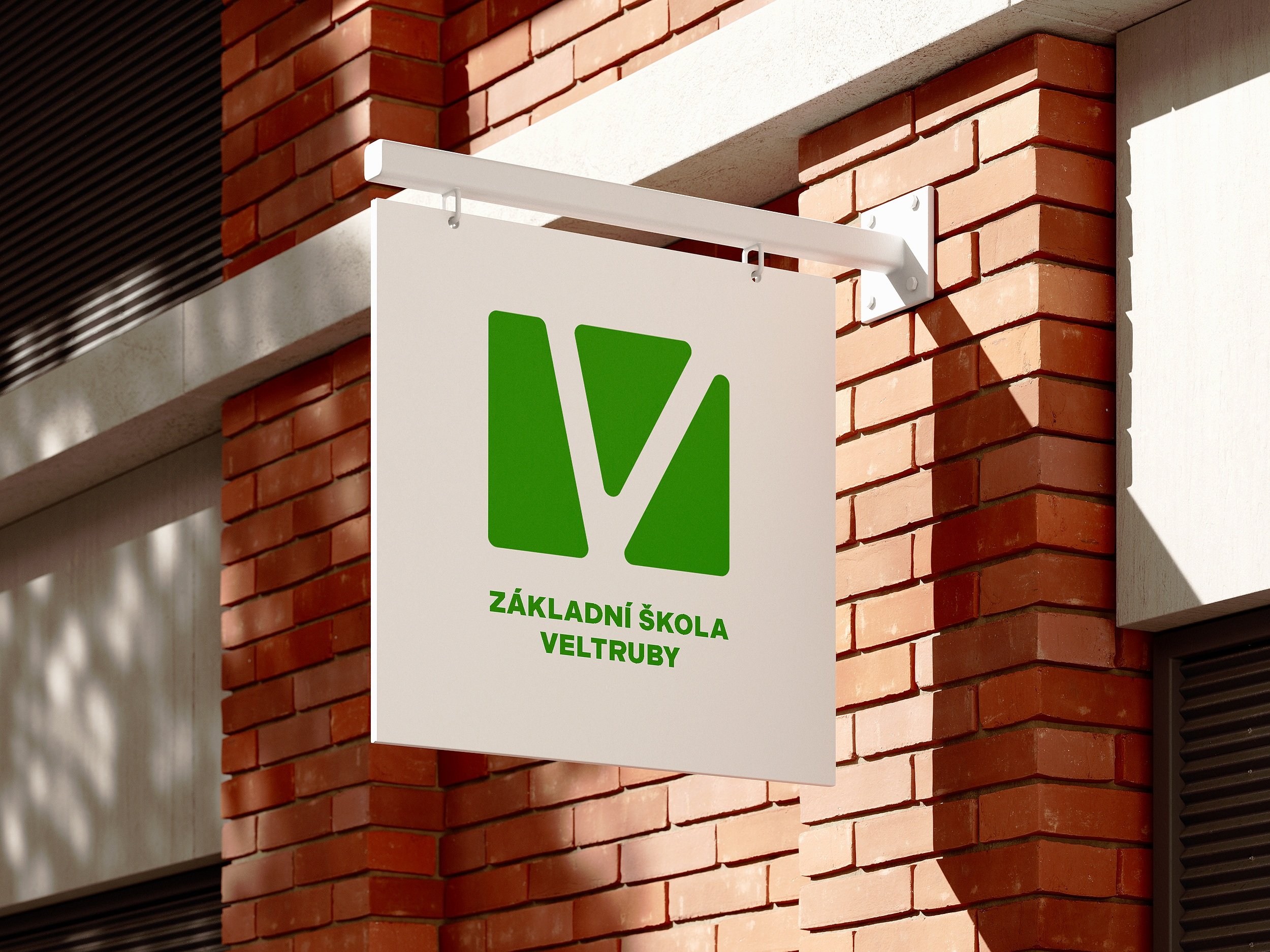
Logo - Design.
The logo is inspired by a simple leaf cutout – a symbol of growth, nature, and tranquility.
It also subtly incorporates the letter V, representing Veltruby. It combines visual clarity with deeper meaning. Modern, timeless, memorable. Exactly as it should be.