
_____________
Designed without the use of AI.
The Idea.
A simple, formal design that transforms the existing, slightly outdated look into a representative and easily recognizable graphic identity.
A design that stands out.

As part of the project, I created a design for the website to ensure it is both clear and functional once again.

In the design, I work with texts and images that extend almost to the edge, representing the library's reach.
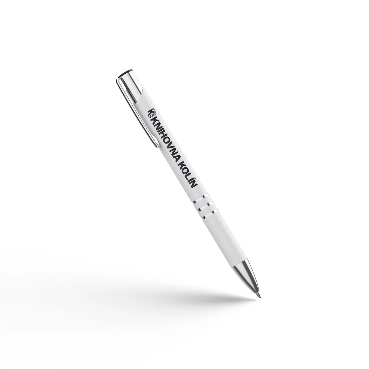

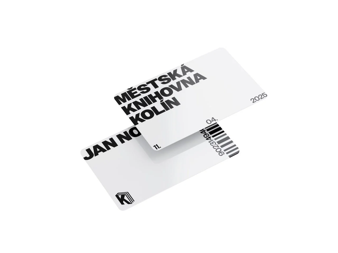
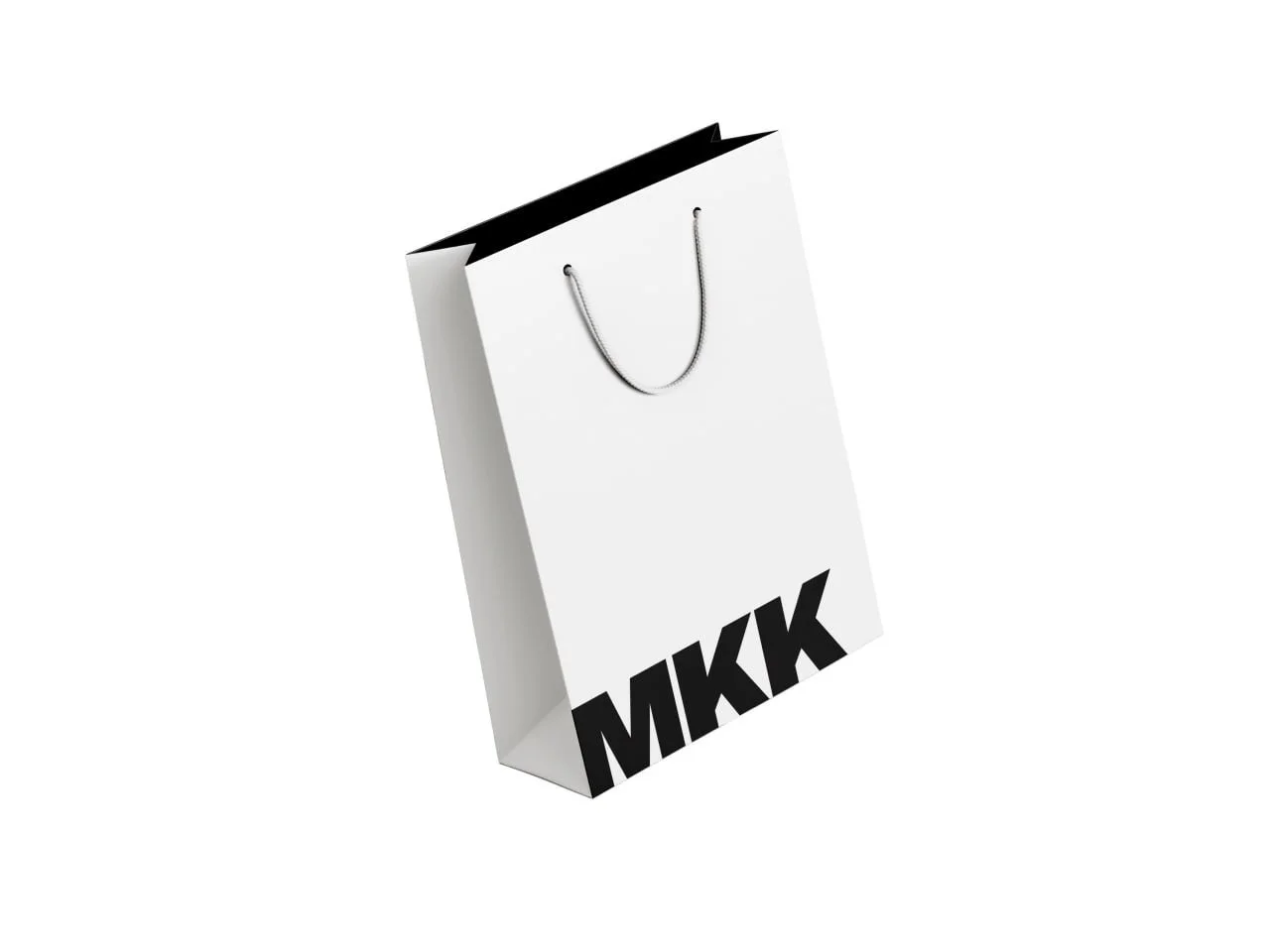
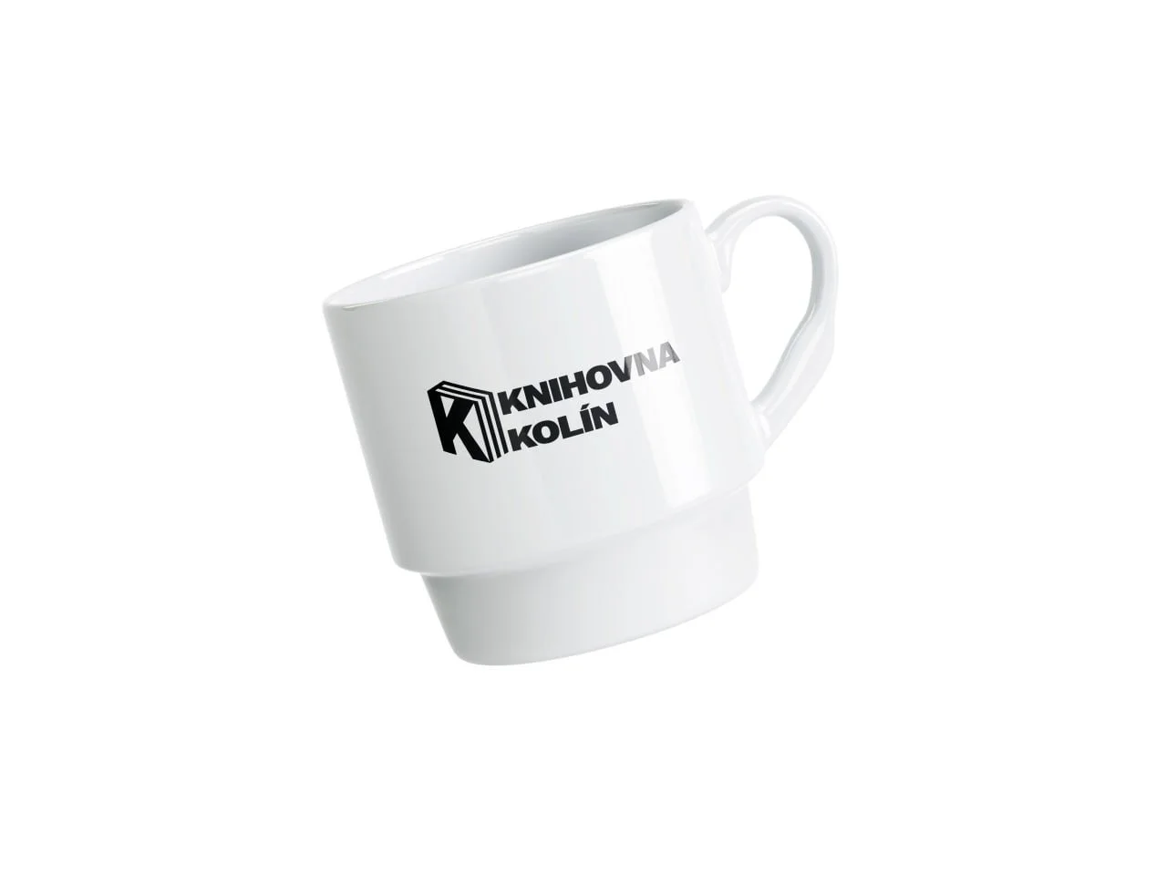
I created additional graphic designs for various memorabilia and functional items to reflect the overall aesthetic of the design.
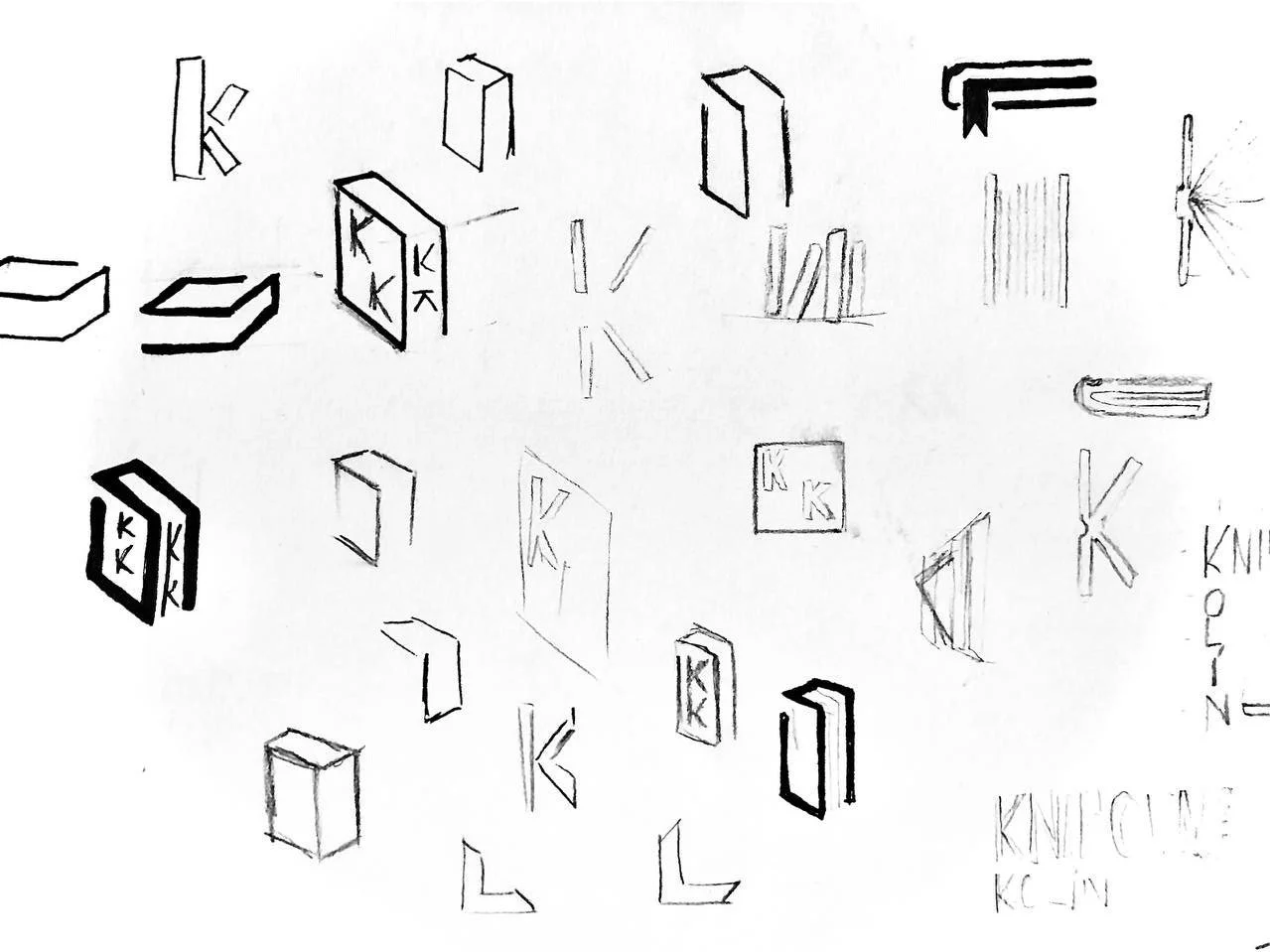
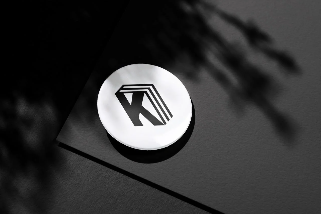
A logo that works.
The logo is designed to convey two key messages:
The letter "K" represents both Kolín and “Knihovna”.
The book-like shape ensures that anyone who sees the logo immediately recognizes it as a library.

It can be used both standalone and in combination with the text “KNIHOVNA KOLÍN” as needed.
In some cases, instead of the logo, the combination of letters “MKK” (MĚSTSKÁ KNIHOVNA KOLÍN) can be used. This variant is primarily for situations where a larger, clearly recognizable design is needed, or when it serves more as a headline.